ASSORTED DESIGNS
GRAPHIC DESIGN
An assortment of minor projects to showcase versatility and style.
Project Date: 2017 - 2019
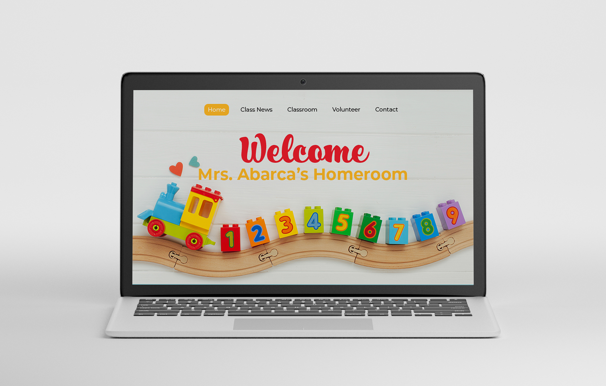
KINDERGARTEN WEBSITE MOCKUP
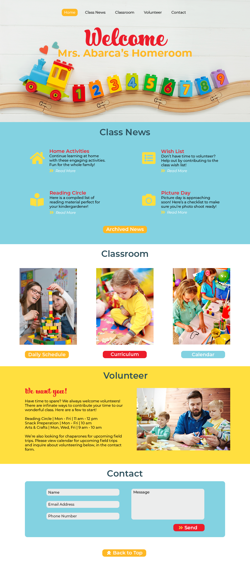
This web design is intended for educational purposes only. The bright, playful color scheme works to engage students and create a sense of interest for parents. The style is meant to be fun and interactive, while keeping the layout simple and responsive. This mock up was created with Adobe Photoshop.
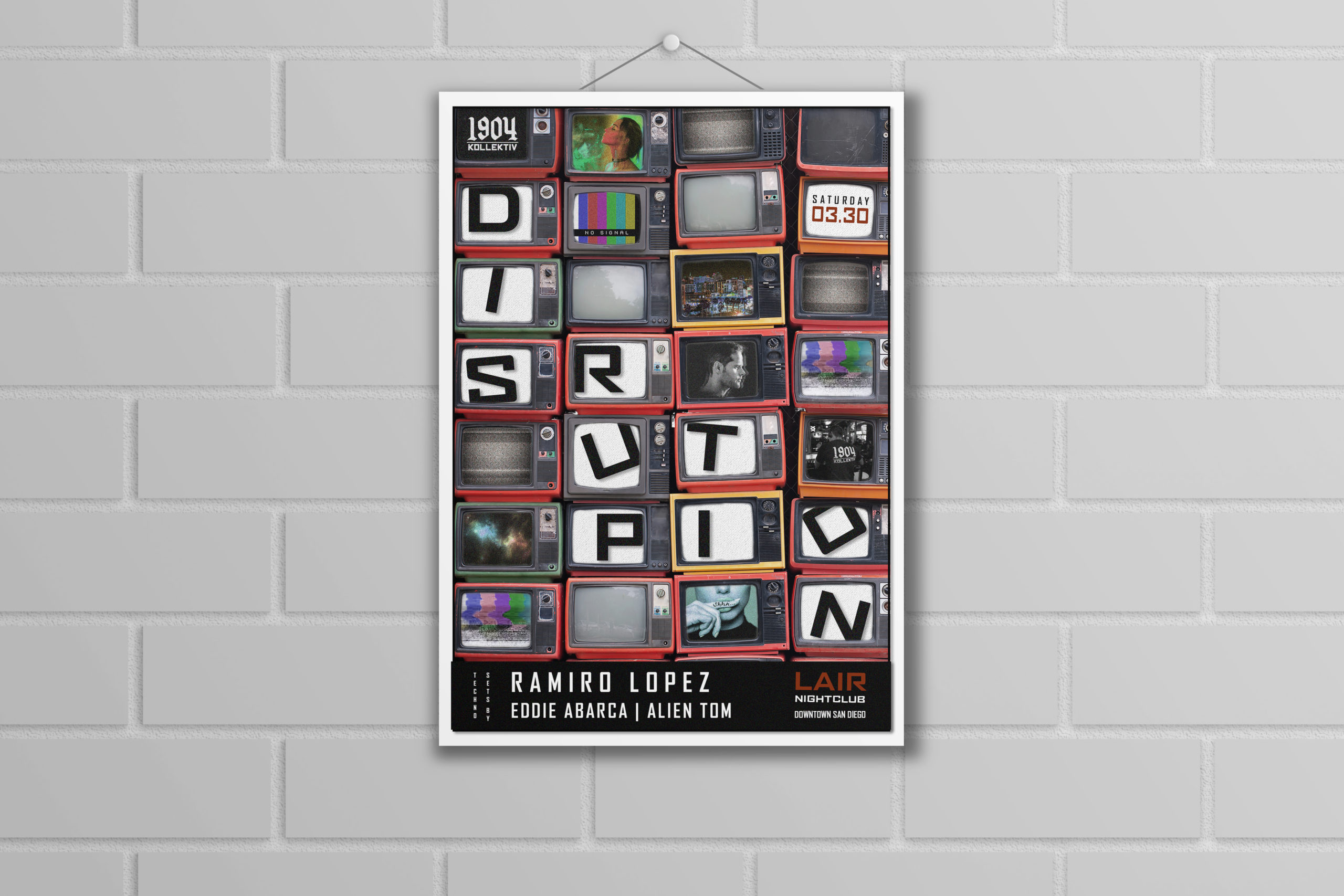
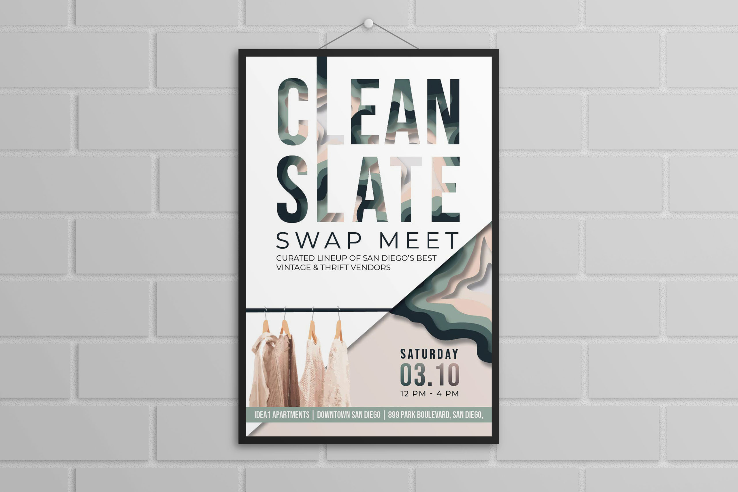
POSTERS
Using mainly Adobe Photoshop, with a sprinkle of Adobe Illustrator, these posters showcase time consuming detail work. For the Clean Slate poster, the “paper cut” effect and clothes hangers are hand drawn vectors. For the Disruption poster, the TVs are manipulated to look stacked on top of each other through careful photo editing. Masking was also used to create the various TV images.
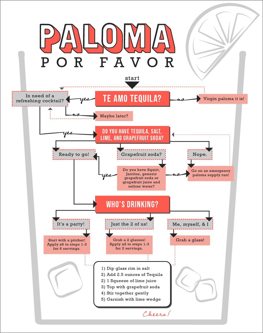
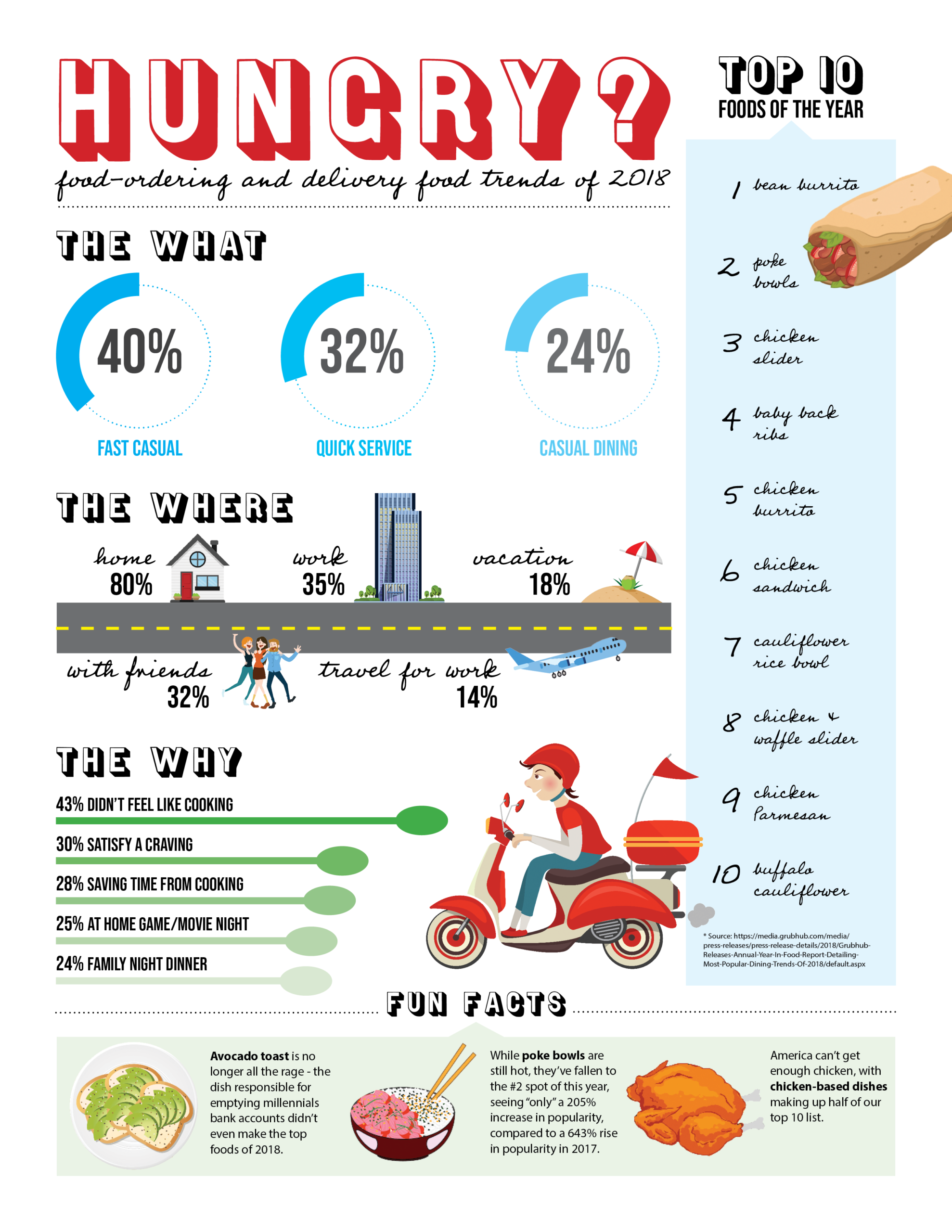

INFOGRAPHICS & DATA VIZUALIZATION
Paloma and Closer Look were designed entirely in Illustrator, while Hungry was designed completely in Indesign, with the help of a few stock vectors. While far from perfect, these fun assignments showcase my love for typography and playfulness with color.
Additional Work

Hunter & MaddoxMarketing Director & Graphic Designer

1904 KollektivCreative Director & Designer
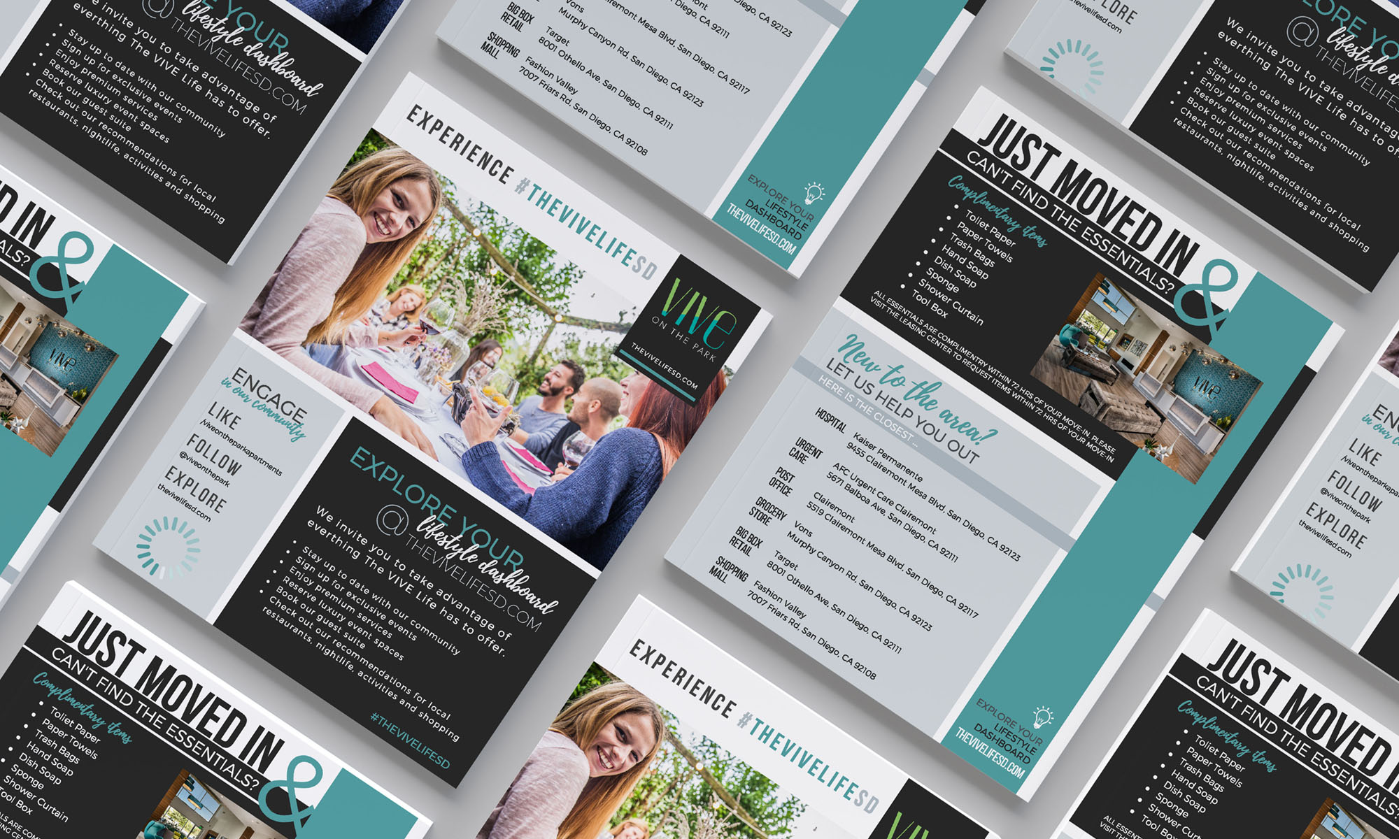
Vive on the ParkCorporate Design

GamesBeat SummitConference Program Collateral
Copyright © 2019 Catherine L McDermott
