HUNTER & MADDOX REAL ESTATE INC.
MARKETING DIRECTOR, BRAND DEVELOPMENT, PRINT DESIGN, DIGITAL DESIGN, LOGO DESIGN
Hunter & Maddox is a boutique luxury real estate brokerage, focused on luxury living in Downtown San Diego.
Project Date: 2019

BRANDING PROCESS
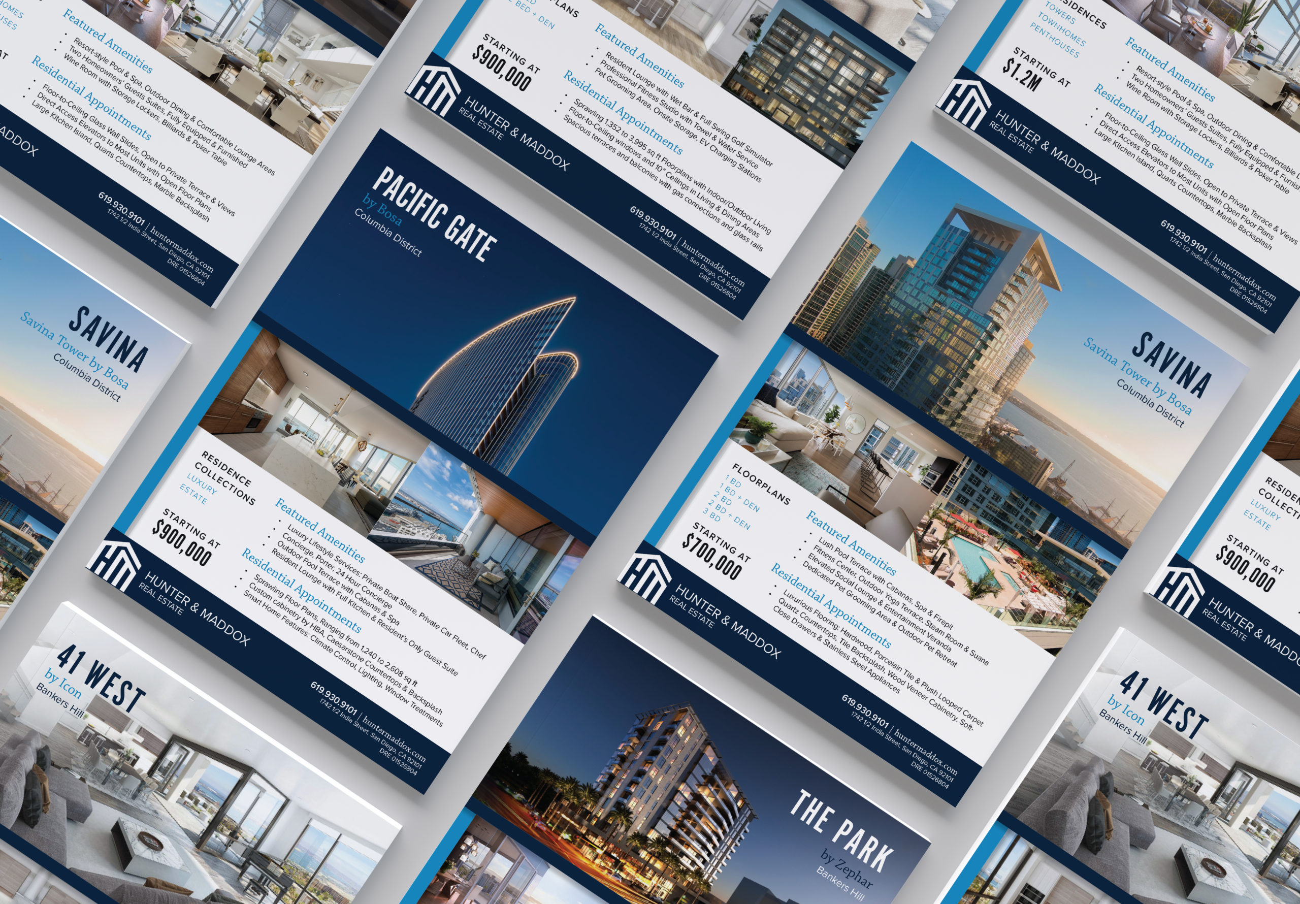
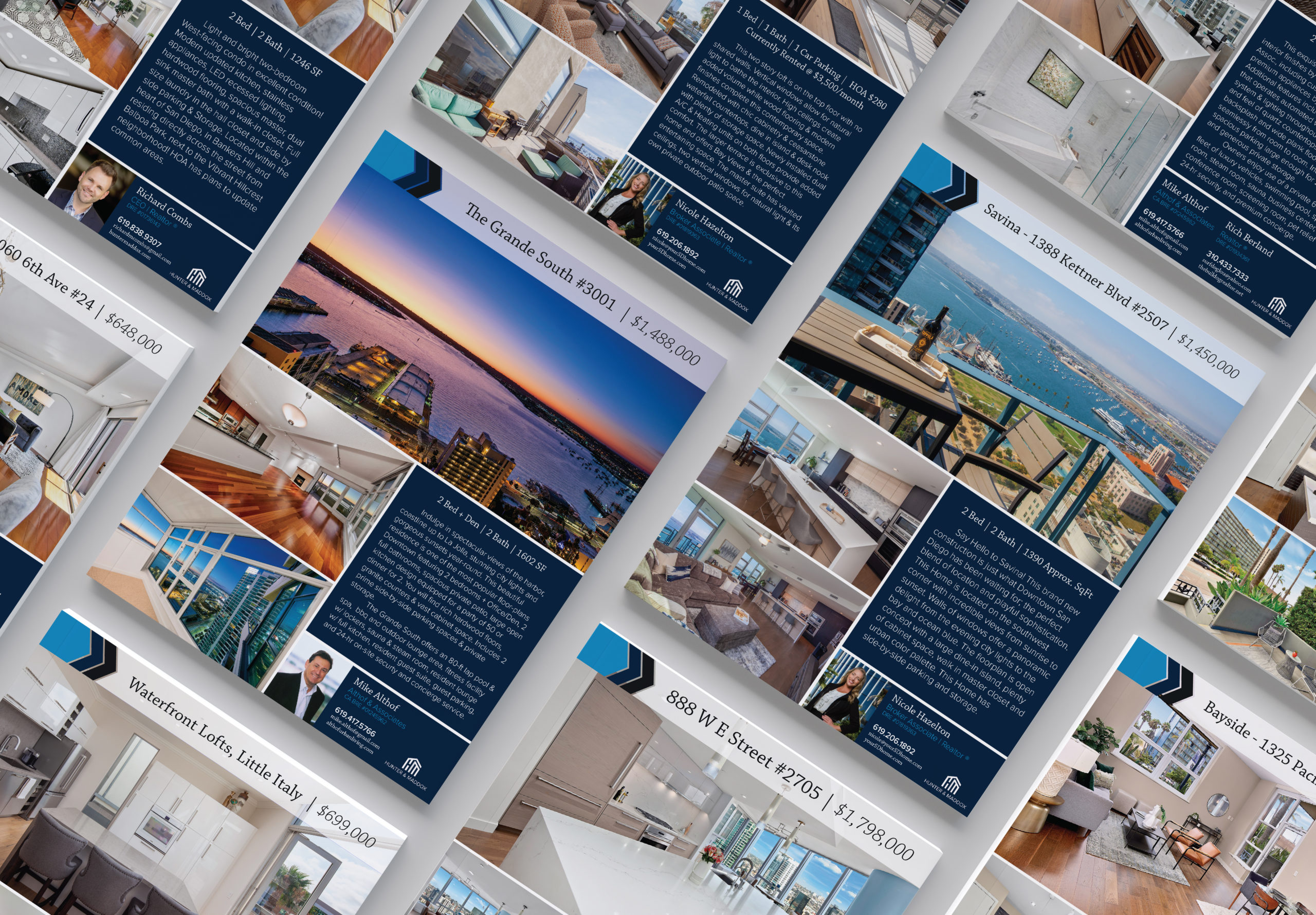
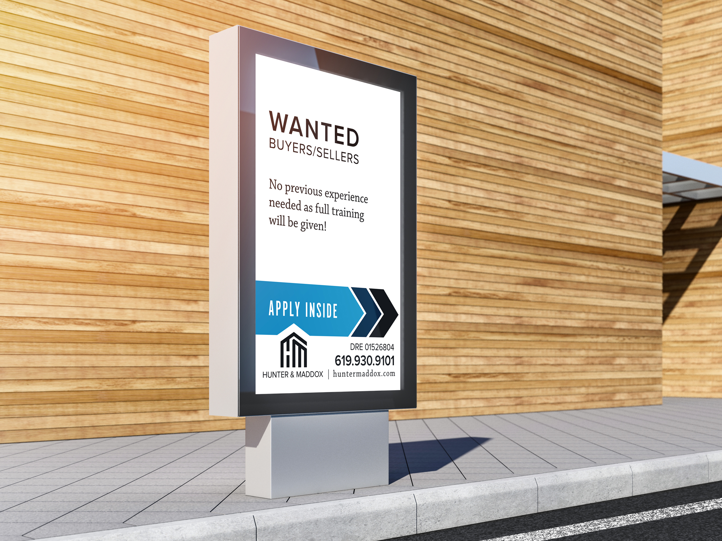
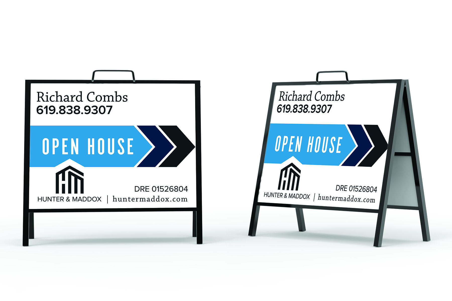
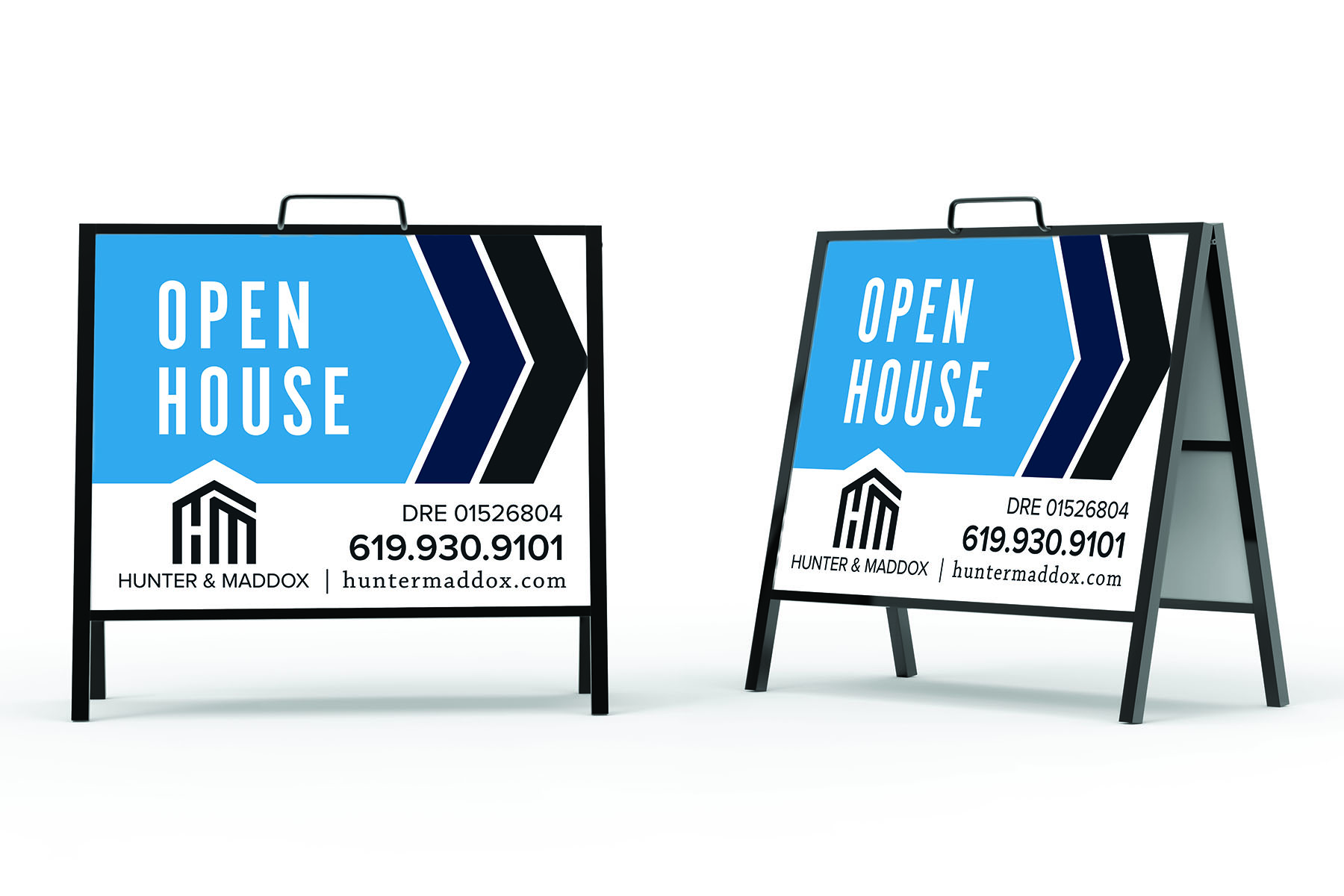
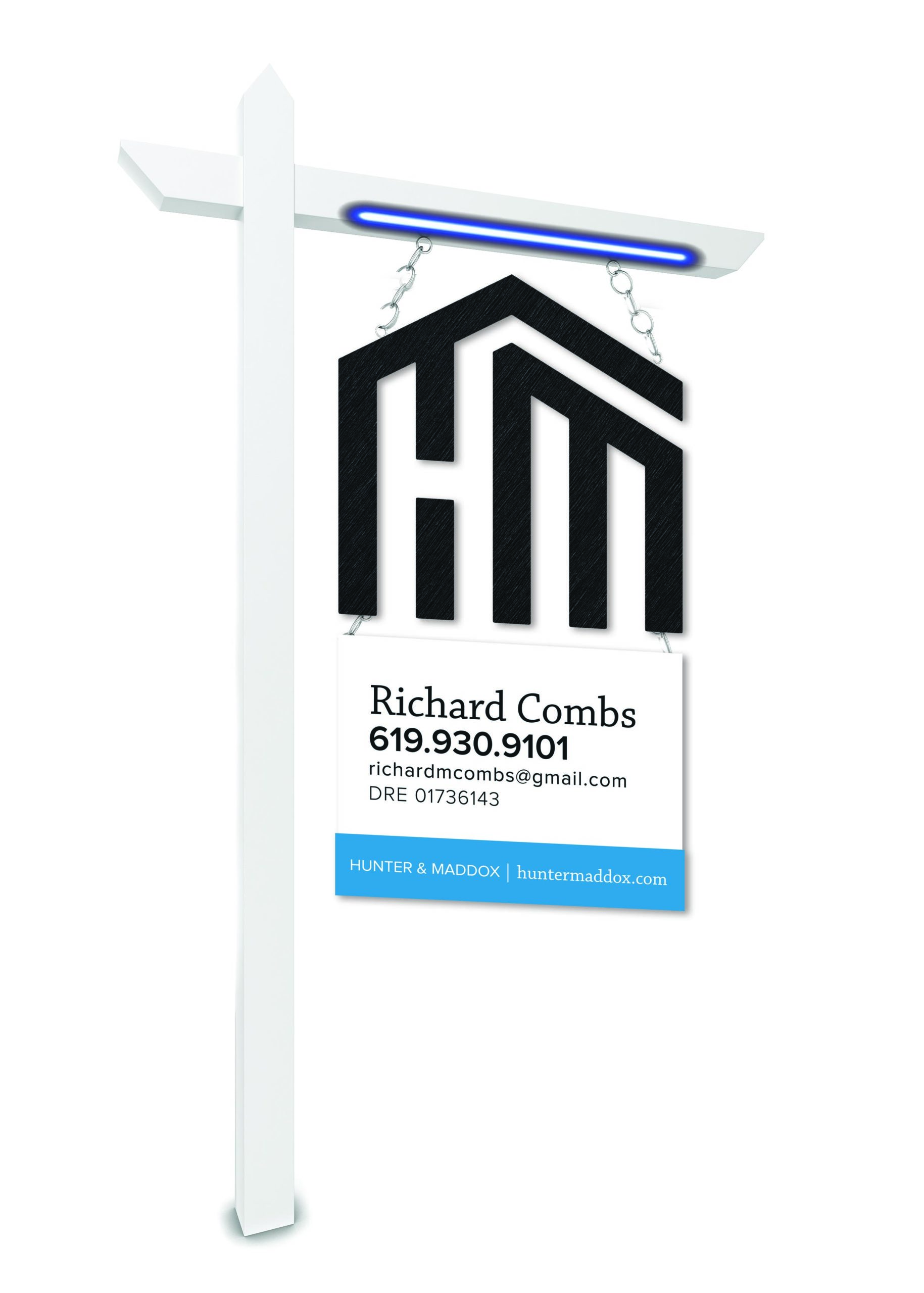
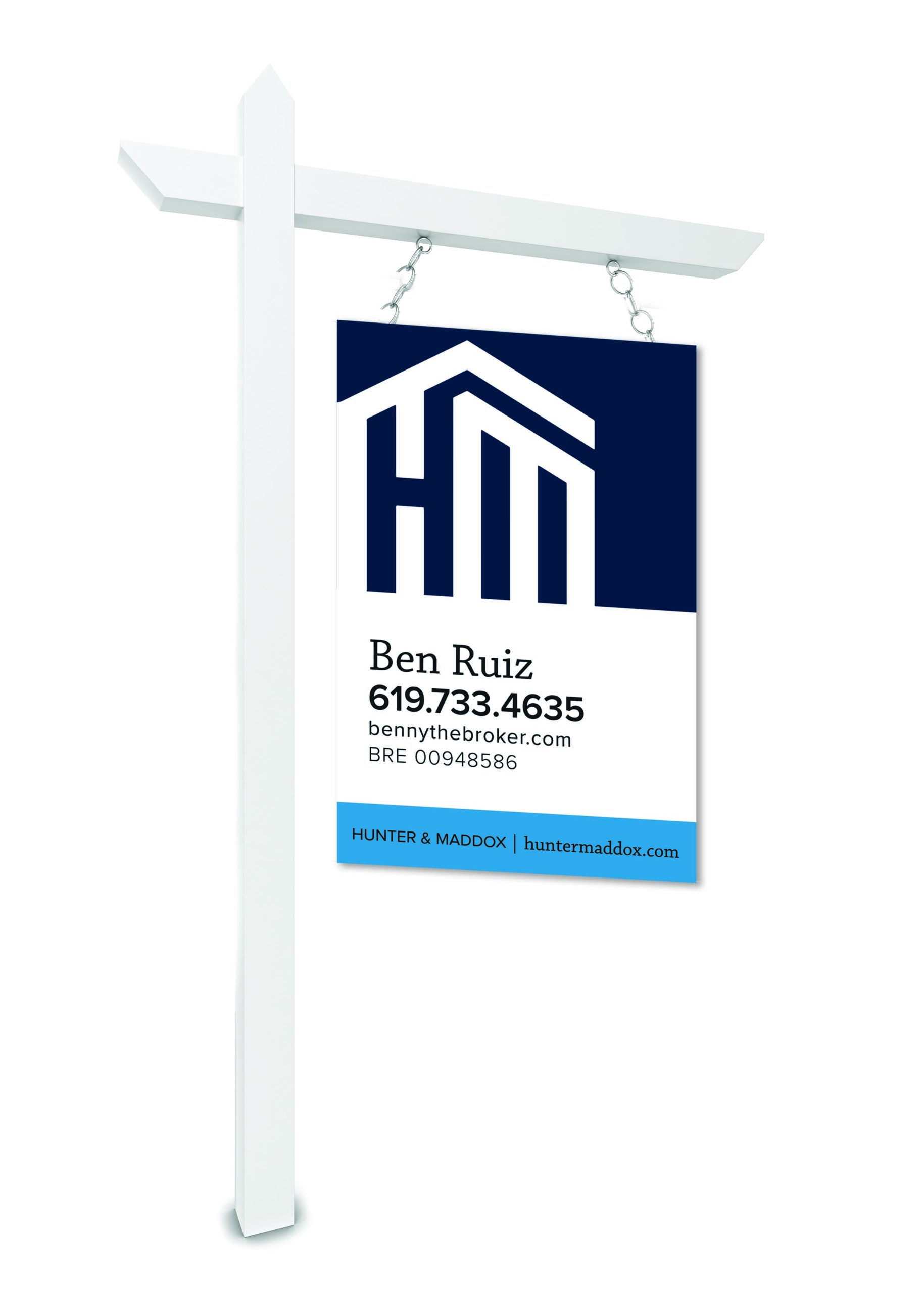
Hunter & Maddox Real Estate moved their office to a vibrant location in Little Italy, Downtown San Diego. With this move, they were looking for a fresh rebranding to stand out from the competitors. The challenge was to create a modern, but classic San Diegan aesthetic that also allowed for clear and direct real estate signage. Working with the CEO, we decided on a coastal, but sophisticated color scheme, balancing a bright cyan, midnight navy with classic black and white. For the typography, we chose Proxima Nova for a crisp, clean typeface that is easily read from a distance. To dress it up, we paired it with Chaparral Pro, offering a classic serif with bold, high-class energy. Lastly, we gravitated towards creating a sense of branding through the repetition of the colors and a crafted arrow design. Since the company’s main purpose for signage is directional and brand recognition, it was important to the client for the designs to be simple and legible, while conveying the lively and modern energy of the brokerage. Within 2 months, the rebranding alone caught the attention of three top producing agents in the downtown market, who ended up onboarding with the brokerage.








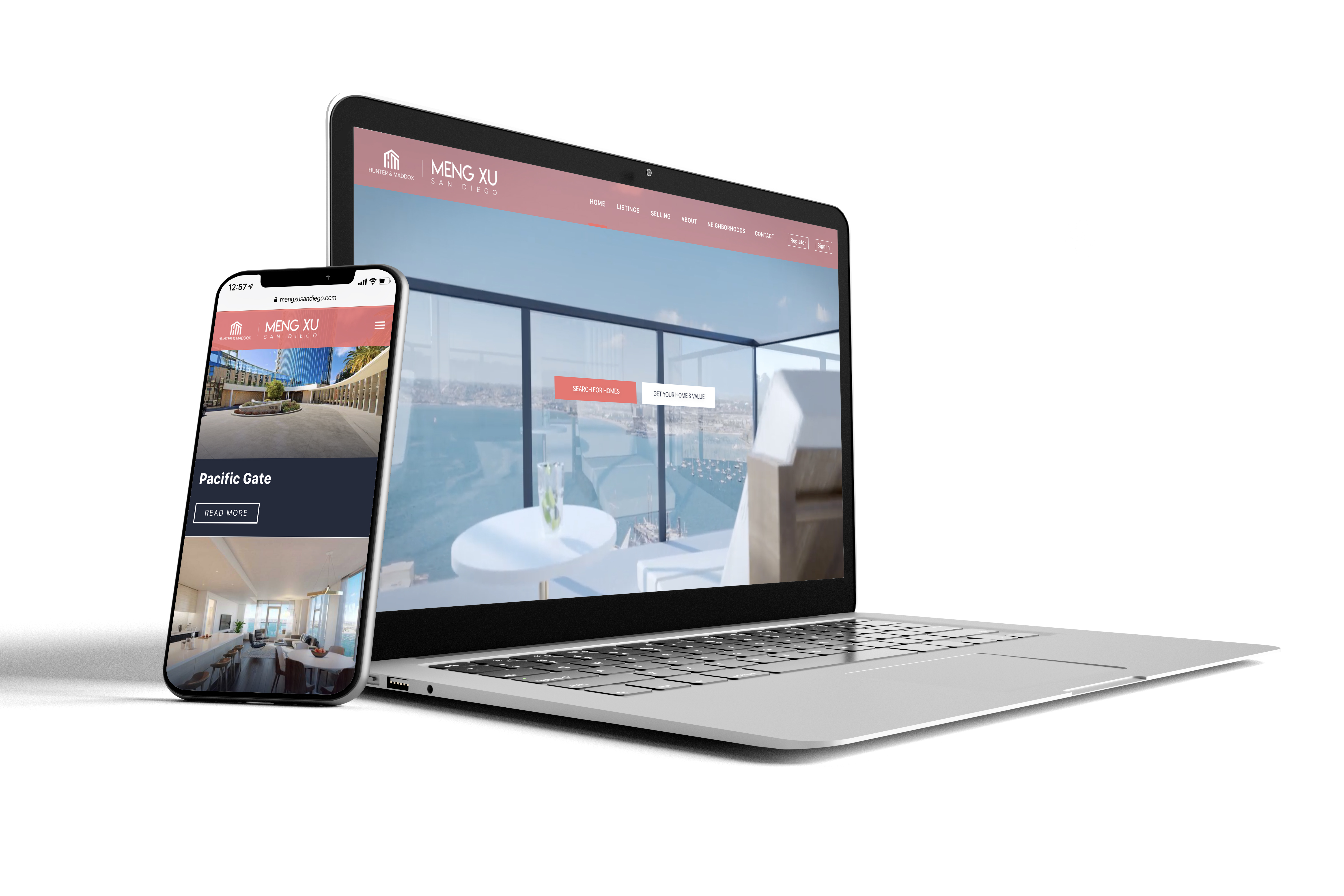





NAME LOGOS
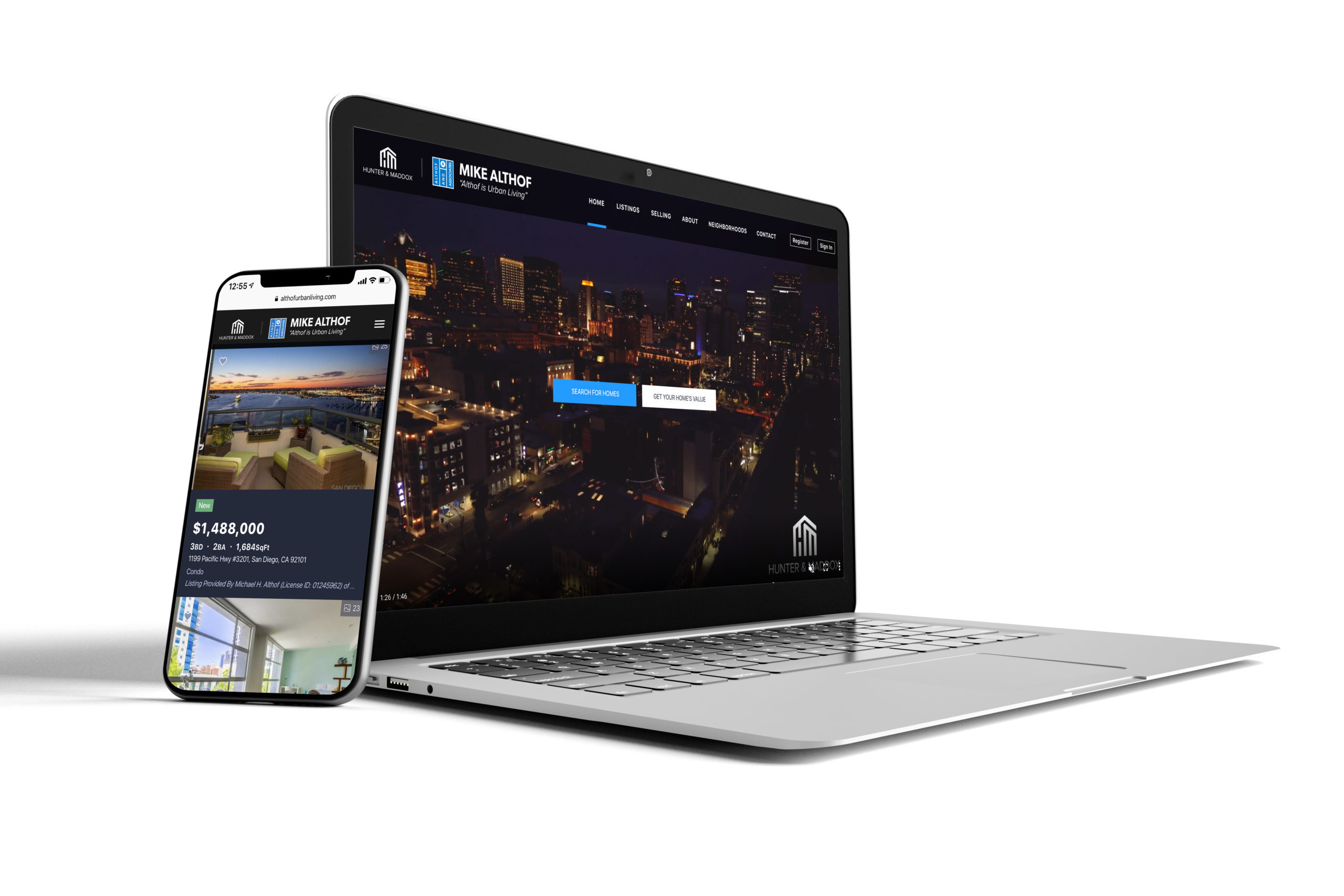
While we wanted to keep the integrity of the brokerage’s branding, empowering each agent to take ownership of their own brand is equally important. Working with individual agents, I crafted simple name logos, unique to their identities.
Additional Work

1904 KollektivCreative Director & Designer
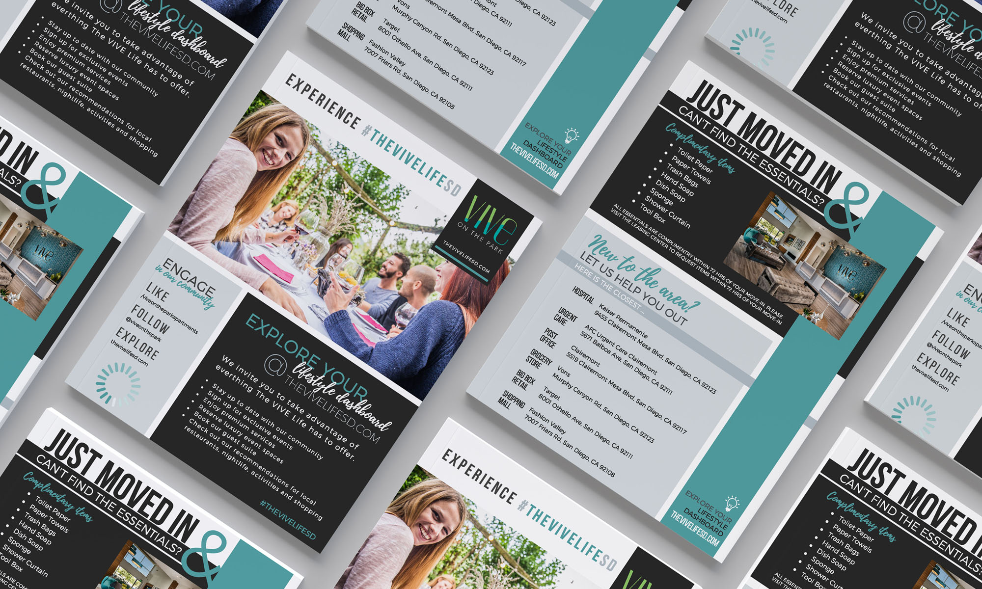
Vive on the ParkCorporate Design

GamesBeat SummitConference Program Collateral
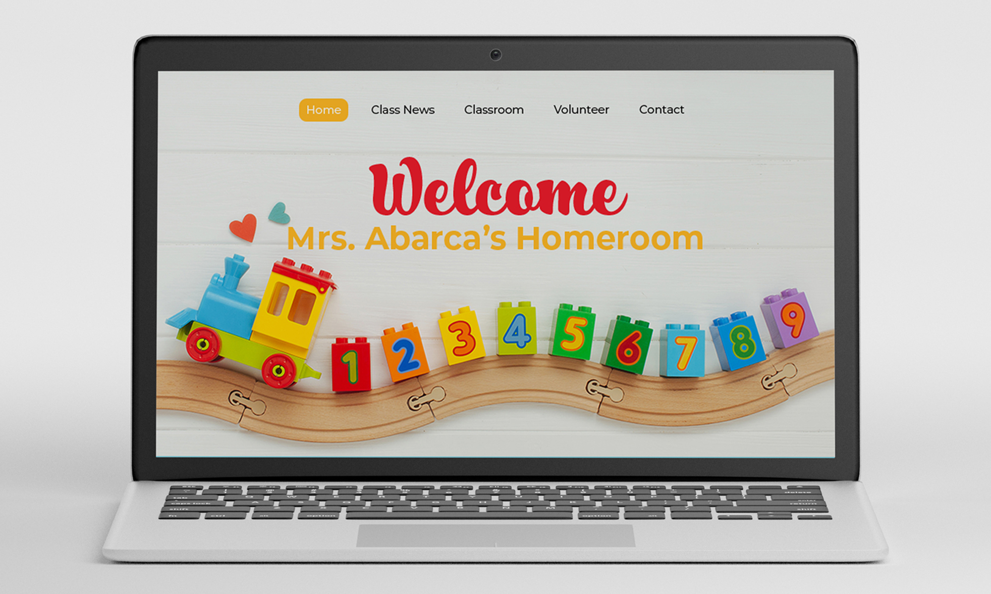
Assorted DesignsGraphic Design
Copyright © 2019 Catherine L McDermott
